-
Composing Compositions (Exercise D)
Prompt:
- Use your phone camera, choose a subject and compose it in various shot sizes and camera angles, while demonstrating your understanding of visual composition.
- Take about 4-6 images.
- State the purposes of using these techniques and how does it affect your audience who perceive your subject.

Eye-level shot Eye-level
- This shot is taken at eye-level with pleasant natural lighting, to give a sense of familiarity and approachability.
- The rule of thirds is also applied here, where the subject’s head is situated to the top left where the lines intersect.
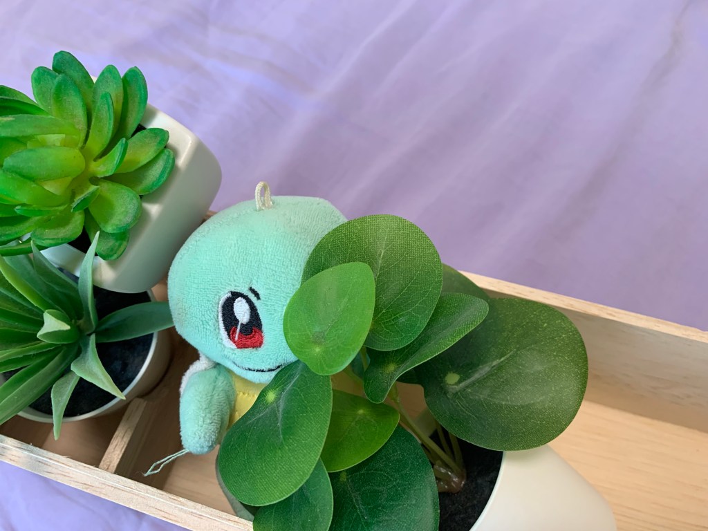
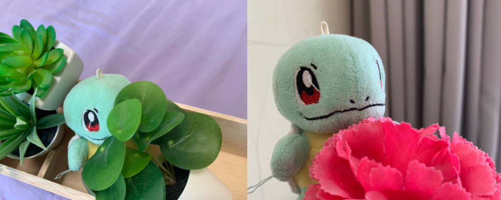
High-angle shot High-angle
- This high-angle shot aims to show how small the subject is. The pose where the subject is shyly hiding itself behind the plants also further emphasises how vulnerable or timid it is.
- The rule of thirds is again applied, where the subject’s head is on the lower left.

Low-angle shot Low-angle
- This low-angle shot is a stark contrast to the previous high-angle shot. This shot exaggerates the subject’s height and size, making it look enormous and gives off a sense of power and majesty.
- Once again with the rule of thirds, the subject’s head is situated at the top one-third of the picture.

Over the shoulder shot Over the shoulder
- This experimental over the shoulder shot depicts the subject looking into the mirror. We can see the subject’s back, and in the mirror reflection, we can see the subject’s face.
- Even though the subject’s back takes up most of the picture, the viewers’ eyes will end up trailing back to the reflection of the subject’s face.
- The reflection of the subject’s face is on the upper left, applying the rule of thirds once again.
-
Assignment 3

Introduction
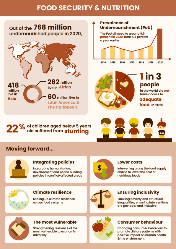
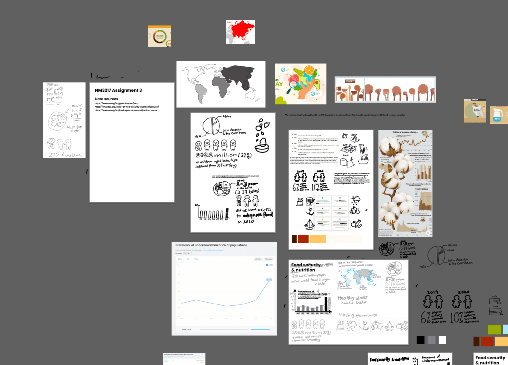
My chosen topic for the infographic is food security and nutrition. I was focusing on how to make the information as easy to digest as possible, especially avoiding big chunks of text.

Submission for critique I used a world map to clearly represent location-related facts, and mapped the same colour intensities to the pie chart underneath it which represents the different proportions of where the undernourished people were from.
To visualise the sudden spike of Prevalence of Undernourishment (PoU) in 2020 after years of it being relatively constant in the years before, I used a bar graph and made the 2020 bar a different colour from the rest, to bring viewers’ eyes to it.
To show 1 out of 3 people not having access to adequate food, I used a pie chart again, but this time I represented it as a plate of food, with two-thirds of it filled with food, and one-third of it only bits and crumbs of food.
For the statistics of children who suffered from stunting, I visualised the percentage as 1 out of 5, with one child being shorter than the other four.
Lastly, for the section on actions to be done moving forward, I created an icon to represent each of the 6 points, to help viewers digest the information more quickly.
Critique: Learning points
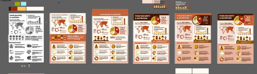
One of the main concerns was that the title of the infographic was not prominent enough, so it was difficult to immediately understand what it is about. Some suggestions include making the title bigger, or putting the title in the red middle section where the children section is at.
Another concern is that the typography on the children section is focusing on the less important information — the exact number — instead of the percentage, which is what was being represented in the 1 out of 5 children visual. The illustration of the children also looked a bit misleading with the line on their heads, so there was a suggestion to add a floor to further emphasise that they are standing on the same ground and one is shorter than the rest.
Upon self-reflection after class, I felt that the overall infographic topic could have been made clearer, such as by having a central/main illustration that summarises the theme. However, this would require reworking almost the entire infographic, so I did not venture into that due to time constraints. Nevertheless, I will still keep this in mind as a learning point.
Improvements
I have enlarged and emphasised the title with a dark colour background block behind it, and I believe that it has helped with the clarity on the infographic’s theme.
I also adjusted the children section to emphasise the “22%” instead of the “149.2 million”, and added some ground below the children.
Final submission Workflow: Adobe workspace
Adobe Illustrator
- I used Illustrator to make all the icons and visuals.
- Tools used: Pen tool, Shape Builder tool, Shape tools
-
Assignment 2
Introduction
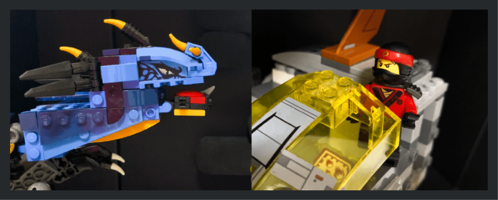
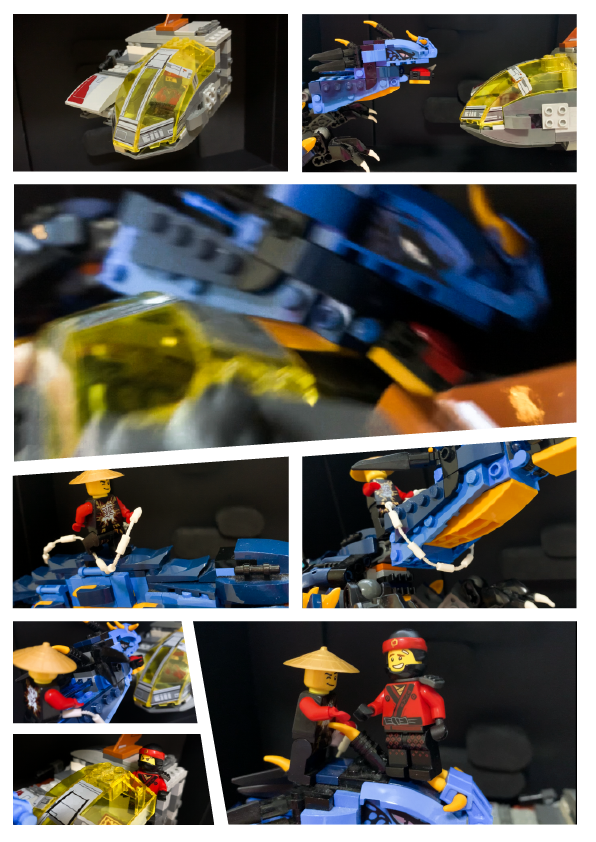
For this assignment, my concept is an action-movie with Lego characters, and I wanted to challenge myself to use good compositions and angles to communicate the action and adrenaline even with the constraints of static photos — and only 6-9 photos at that — while also telling a story without text.
Storyboard
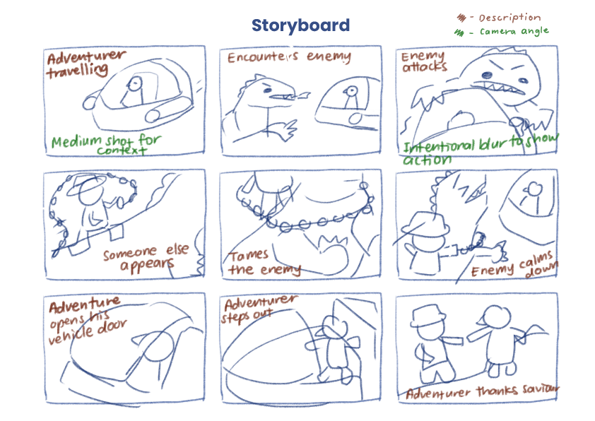
Storyboard sketch For the storyboard, I started by allocating the number of frames I want to spend on the beginning, middle and end of the story, to ensure that the pacing made sense. Next, I substantiated the contents of each frame, describing what the purpose of each frame is (as shown by the notes in brown). After that, I started to consider what type of shots would be most effective in communicating the intended message of each frame (as shown by the notes in green). For example, in the first frame, I wanted the shot to be far enough to give context of the environment and the vehicle, or in the third frame, I wanted to have motion blur to show the chaos when the dragon enemy attacks. With all that information, I proceeded to draw out the compositions of the frames I had in mind.
Layout
After the shots were taken, it was time to edit them and arrange them into the A4 format. I opted for a comic book style panel layout, mainly incorporating slanted edges to further emphasize the action element of the photos. I was mindful of the sizes of each shot — I wanted the larger photos to emphasize meaningful parts of the story, and wanted to group related shots together by keeping them in similar sizes and in the same row or column.
Critique submission Critique & Improvements
The main comment from the critique is that there was insufficient context as to where the side character came from — was he always on the dragon’s back all along, or did he hop in halfway to save the adventurer from the dragon?
The side character in question A suggestion from my peers and Prof Kai was to add one more shot of the character hopping or landing on the dragon.
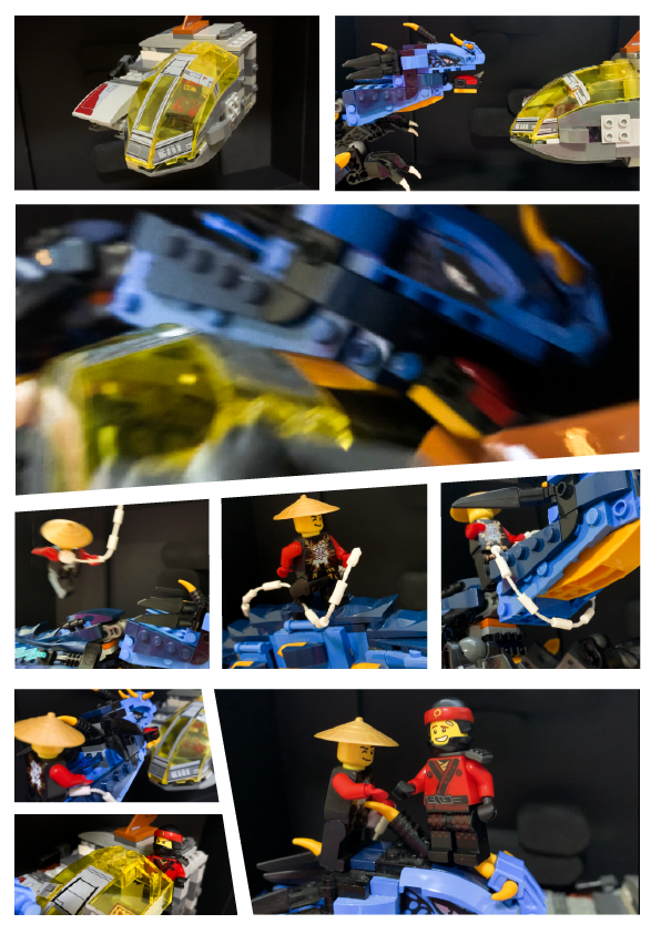
I took the suggestion of adding one more shot of the side character jumping on the dragon, and I think it has helped to make the story flow more smoothly, as shown in the improved prototype below.
Improved prototype Workflow with Adobe
Adobe Photoshop
- I used Photoshop to sketch my storyboard

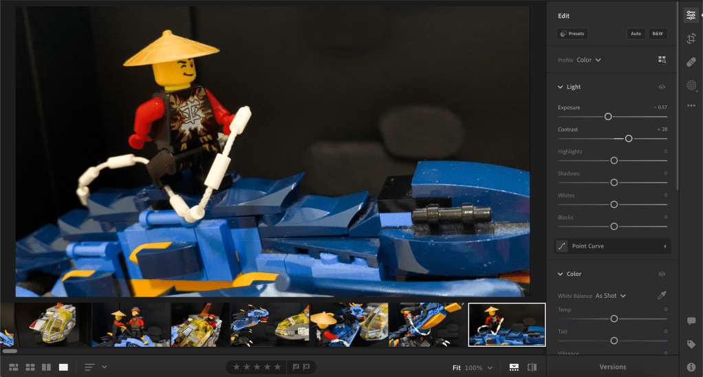
Screenshot of Adobe Photoshop workspace Adobe Lightroom
- I used Lightroom to adjust the colours of the photos, mainly to increase the contrast, which I thought was common in action-themed content.
Screenshot of Adobe Lightroom workspace Adobe Illustrator
- I used Illustrator to arrange the photos in the layout and to manipulate the edges and slant them for the comic book look.

Screenshot of Adobe Illustrator workspace -
Assignment 1

Introduction
My goal for this assignment was to simplify my image by abstracting it to the essentials, only keeping the features that keep it distinguishable and getting rid of noise.
Thought progress
My thought process over the stages are as follows. (Note that this is for the critique submission version.)
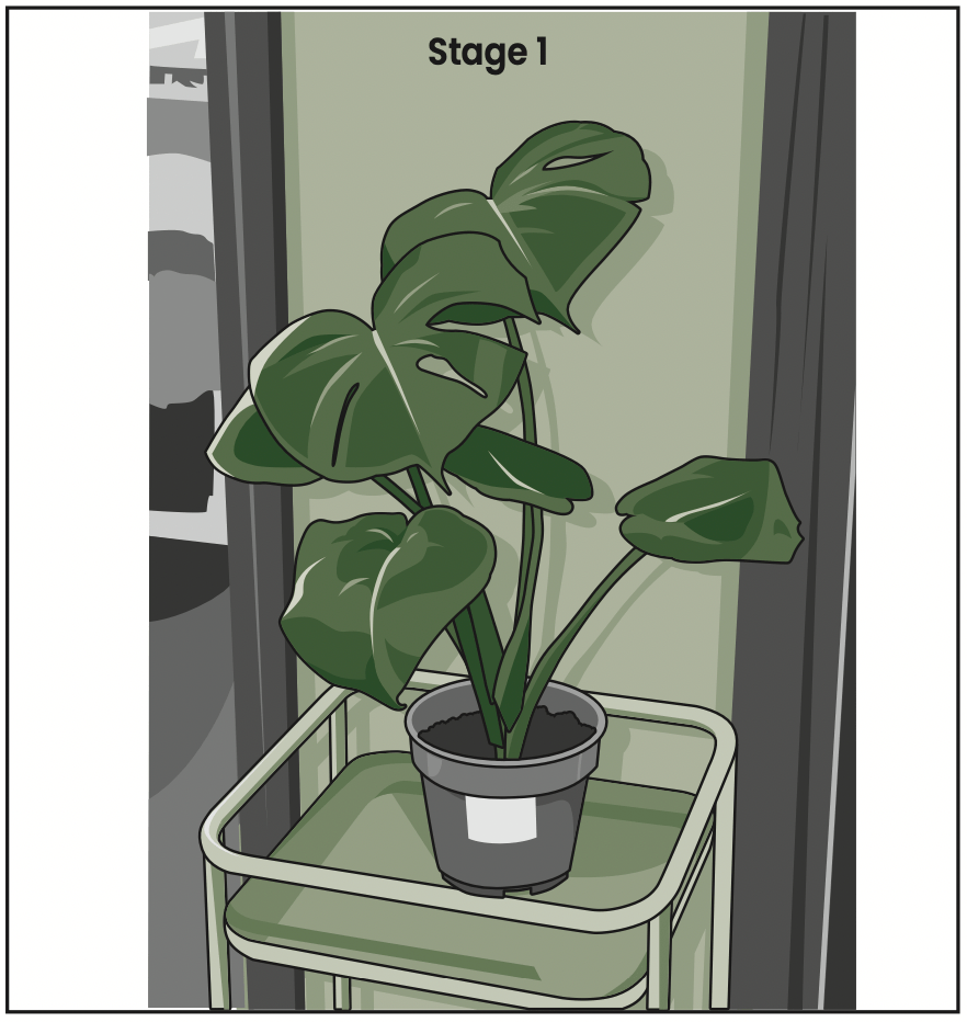
In stage 1, I tried to keep the design as detailed as I could, focusing on textures and lighting. I used the Pen tool to trace the outline of the monstera plant, conserving the imperfections of the leaf shapes. I added cell shading to emphasise the soft texture of the leaves, the smooth surface of the pot and stand, and the wooden texture of the wooden door frames in the background.

In stage 2, I removed the line art, background and cell shading. I maintained the sense of depth by colouring the leaves in different shades of green, but now each leaf is one flat colour each. I also simplified the details on the pot.

In stage 3, I made the whole plant the same shade of green, and added negative space around the leaves to maintain the silhouettes. I also decided to remove the plant stand since it was not the main focus of the picture.

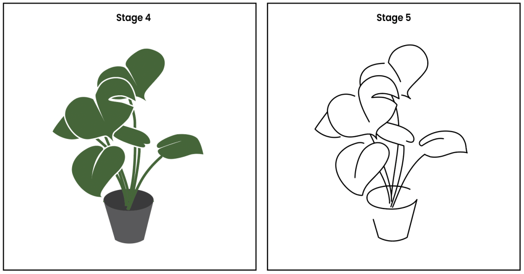
In stage 4, I simplified the shapes. I smoothened the outline of the leaves and pots, and removed almost all the stem and line details on the leaves.
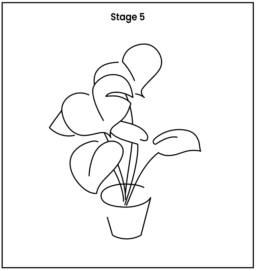
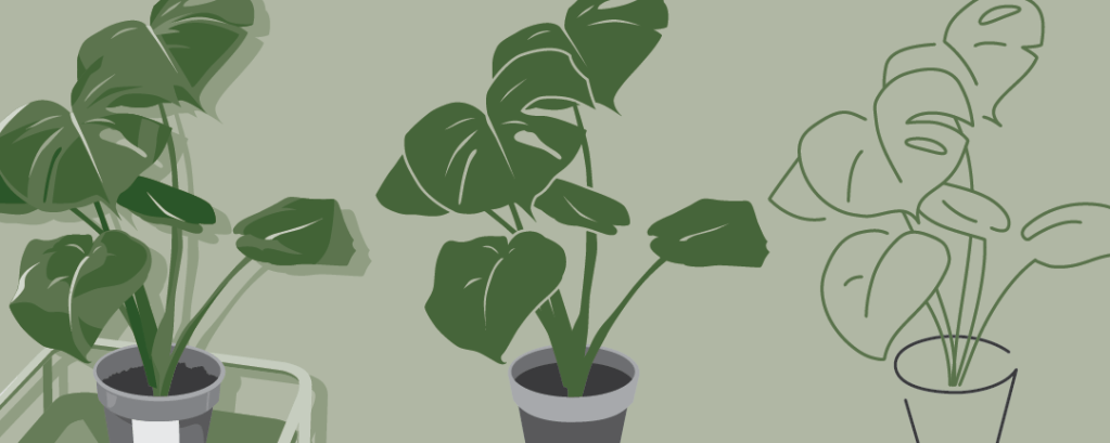
In stage 5, I opted for a full line art style to really put the abstraction to the test. I traced the silhouette from stage 4, focusing only on the parts that defined the plant’s shape. I left some gaps in the tracing, to add a more stylized look.
Feedback from critique
One comment from my peers was that the jump from stage 4 to 5 was a little too drastic. Another comment from my peers was that it was not very apparent that this is supposed to be a monstera plant, it looks like a bunch of heart shapes.
A comment from Prof Kai was that the silhouette could be clearer if the intersecting lines were cleaned up with the Scissor tool. Another comment from Prof Kai was that a green tint on the line art could help viewers better identify this to be a plant.
Improvements since critique
With those comments in mind, I made changes for stage 4 and 5 as follows.
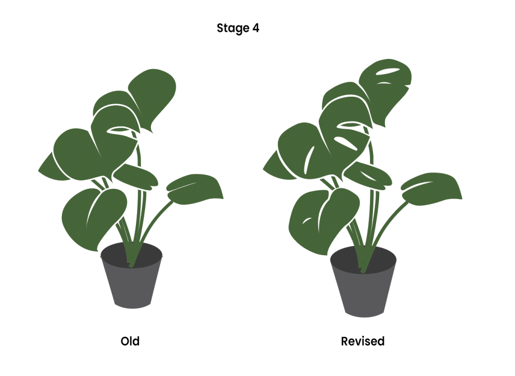
I decided to bring back some of the details of the holes and veins on the leaf to both stage 4 and 5, with the purpose of helping viewers better identify this as a monstera plant.
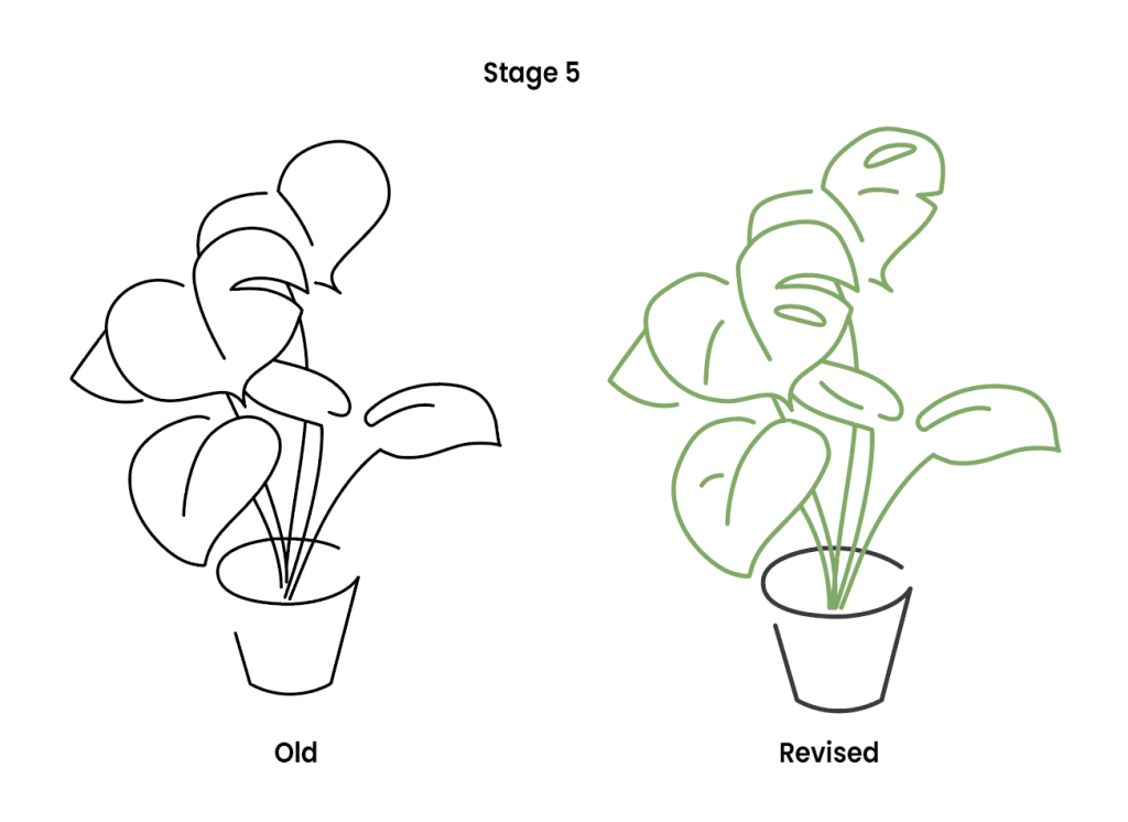
I took up the suggestion of cutting away the intersecting part of the lines. This helped to maintain the depth of the leaves from stage 4. I also took up the suggestion of making the line art on the plant part green to further emphasise that this is a plant.
Workflow

Screenshot of Adobe workspace (Illustrator) The main tools I used were:
- Pen tool
- Layers
- Outline Stroke
- Shape Builder tool
I used the Pen tool and Layers function to trace the shapes and draw the shadows, with the original image in a locked layer underneath the tracing layer. I used the Outline Stroke function and Shape Builder tool to create the negative space around the leaves in stage 3, instead of leaving them as white outlines.
Latest from the Blog
-
Brand Guideline (Final Project)
Thought process For the final project, I went with the first option (self-identity). My logo consists of my name in a clean but casual sans serif font, to give off a professional but friendly impression. The tangerine cap is a word play on “Tenges”, my surname. On a more personal level, my parents’ business was… Read more
-

Pattern (Exercise G)
Prompt: I decided to draw ginkgo leaves for the pattern, starting off with only two leaves, and slowly drawing more. In the later stages, I started adding some dark colour for the background and also added some shading for the leaves that are further behind for a sense of depth. In the last stage, the… Read more
-
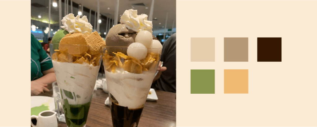
Colour scheme (Exercise F)
Prompt: Pick out five hues from the image and write a VERY SHORT write up on the hues, what mood are they conveying, if they are working well… The earthy brown and green hues bring a cozy and relaxing mood, which is very fitting for this image of parfaits taken at a homey cafe. The… Read more
