Category: NM3217 Principles of Visual Communication Design
-
Brand Guideline (Final Project)
Thought process For the final project, I went with the first option (self-identity). My logo consists of my name in a clean but casual sans serif font, to give off a professional but friendly impression. The tangerine cap is a word play on “Tenges”, my surname. On a more personal level, my parents’ business was…
-

Pattern (Exercise G)
Prompt: Using what you have learnt on elements of design, draw/create a pattern. You should also range it from the lightest to the darkest. I decided to draw ginkgo leaves for the pattern, starting off with only two leaves, and slowly drawing more. In the later stages, I started adding some dark colour for the…
-
Colour scheme (Exercise F)
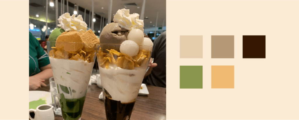
Prompt: Pick out five hues from the image and write a VERY SHORT write up on the hues, what mood are they conveying, if they are working well… The earthy brown and green hues bring a cozy and relaxing mood, which is very fitting for this image of parfaits taken at a homey cafe. The…
-

Typography Case Study (Exercise E)
Prompt: What seems to be off about this particular typographic representation? How would you improve this typographic representation (look into the 8 rules for guiding points for discussion) This typographic representation is going against 3 of the 8 rules we learnt. Rule 4: Readability The outline on both the title and body text is distracting…
-
Composing Compositions (Exercise D)
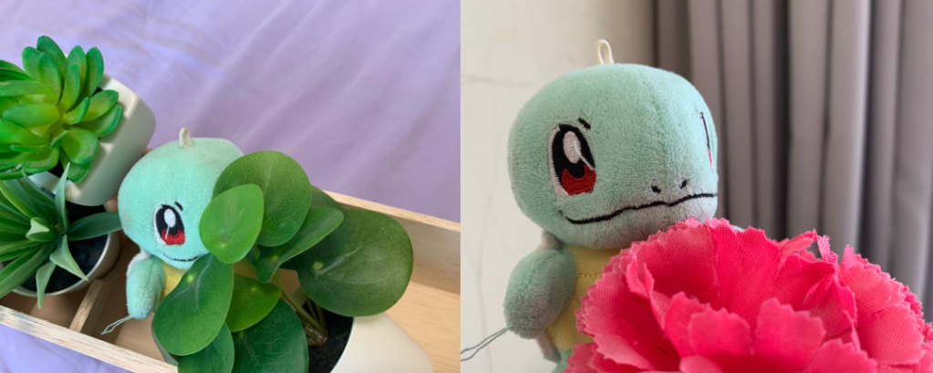
Prompt: Use your phone camera, choose a subject and compose it in various shot sizes and camera angles, while demonstrating your understanding of visual composition. Take about 4-6 images. State the purposes of using these techniques and how does it affect your audience who perceive your subject. Eye-level This shot is taken at eye-level with…
-

Assignment 3
Introduction My chosen topic for the infographic is food security and nutrition. I was focusing on how to make the information as easy to digest as possible, especially avoiding big chunks of text. I used a world map to clearly represent location-related facts, and mapped the same colour intensities to the pie chart underneath it…
-
Assignment 2
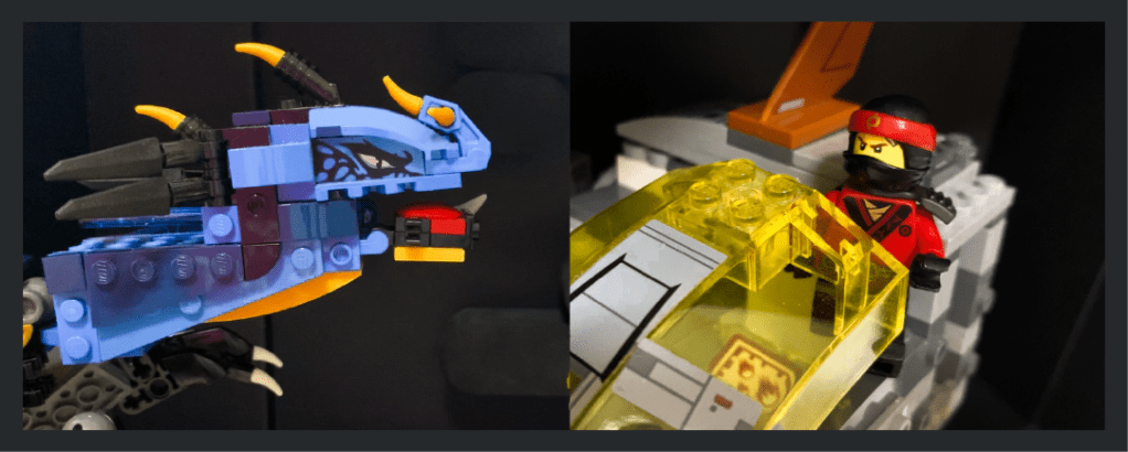
Introduction For this assignment, my concept is an action-movie with Lego characters, and I wanted to challenge myself to use good compositions and angles to communicate the action and adrenaline even with the constraints of static photos — and only 6-9 photos at that — while also telling a story without text. Storyboard For the…
-

Assignment 1
Introduction My goal for this assignment was to simplify my image by abstracting it to the essentials, only keeping the features that keep it distinguishable and getting rid of noise. Thought progress My thought process over the stages are as follows. (Note that this is for the critique submission version.) In stage 1, I tried…
-

The Signs and Symbols of Heinz (Exercise C)
Signifier We can see that the top of the ketchup bottle is a tomato, and the entire bottle is sliced up and has texture similar to that of a tomato. We also note that the message on the ad says “No one grows Ketchup like Heinz”, in a similar fashion to how we would describe…
-
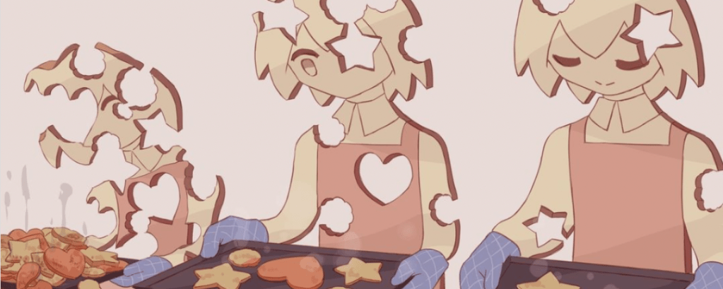
Constructive Criticism Model (Exercise B)
Japanese artist Avogado6 is known for their expressive symbolic illustrations that usually have a dark twist. I chose to evaluate this artwork, titled “制作 クッキーのきもち”, which roughly translates to “feelings of a production cookie”. Description: What is going on in the artwork? The artwork depicts 3 characters made out of cookies who are baking cookies.…

