-
Brand Guideline (Final Project)
Thought process
For the final project, I went with the first option (self-identity).
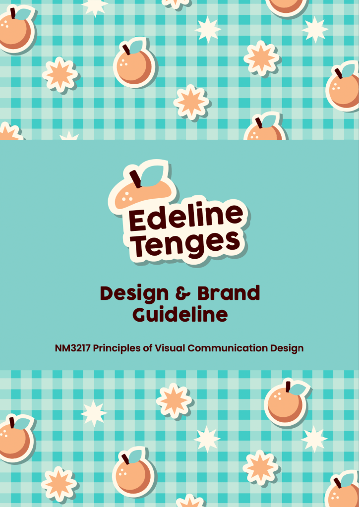

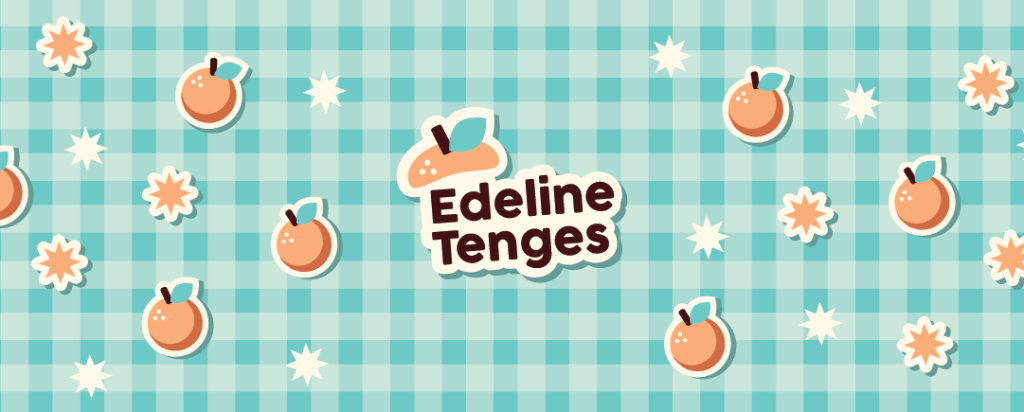
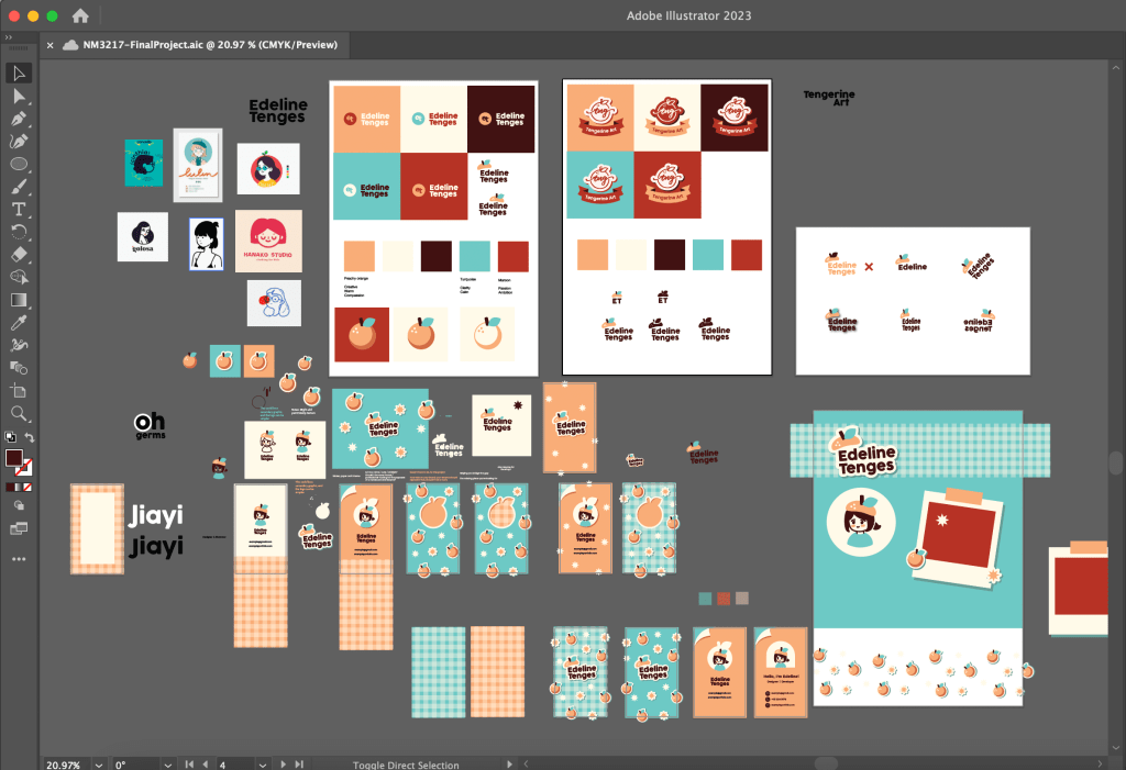
My logo consists of my name in a clean but casual sans serif font, to give off a professional but friendly impression. The tangerine cap is a word play on “Tenges”, my surname. On a more personal level, my parents’ business was originally named Orange, so I thought the tangerines theme would be nice.
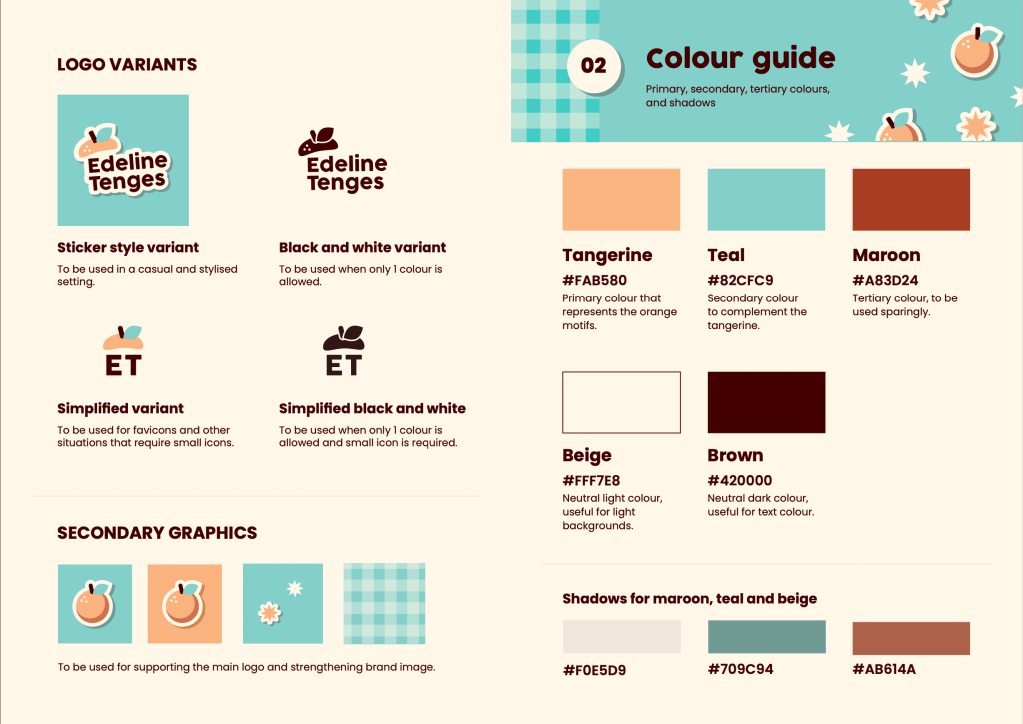
I created a stylised sticker version of the logo, along with other sticker-style secondary graphics. I run a small sticker shop on the side, so I thought stickers would be a great way to express myself. Stickers allow people to add personality to their everyday items, and in a deeper sense, people can keep their fond memories as a keepsake through stickers.
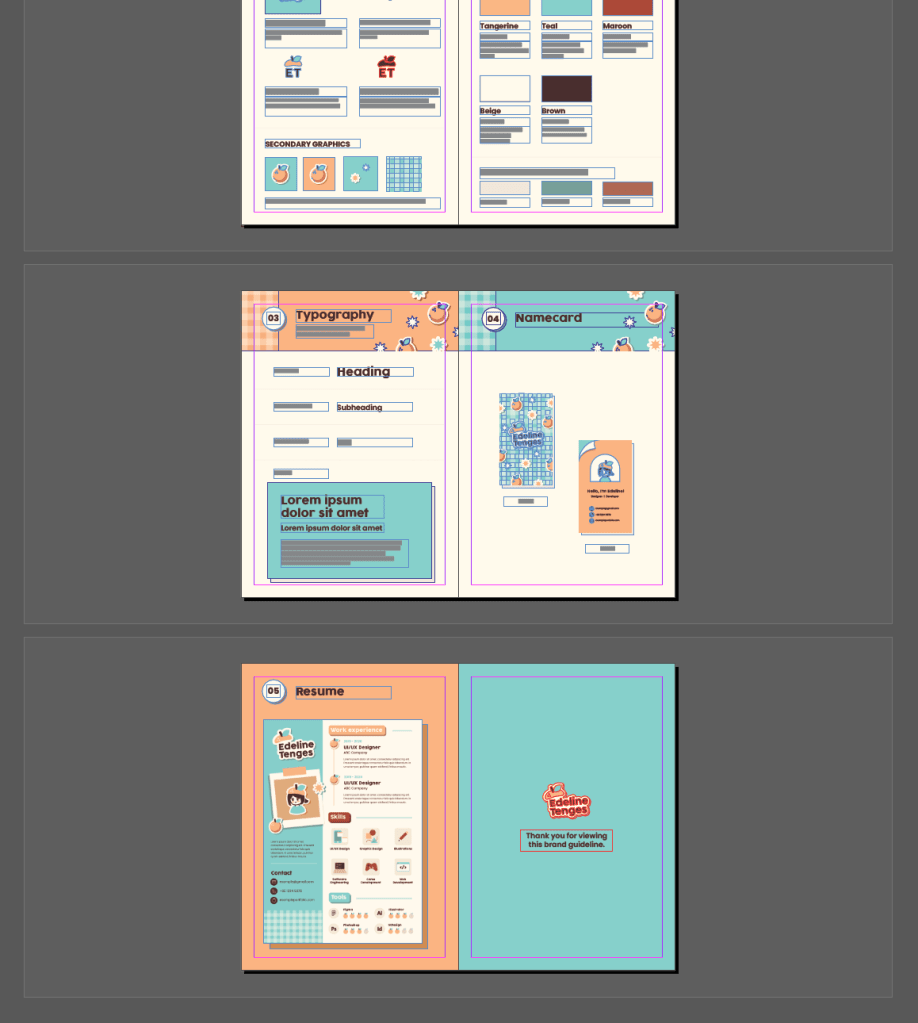
While coming up with the colour scheme, I started with a soft peachy-orange colour based on the tangerine theme. I added teal to complement the orange, and then I chose another warm colour maroon to add further depth to the colour scheme. I also like having a slightly beige and creamy colour to replace plain white, and a dark brown shade to replace pure black. Along the way, I also added colours for shadows because of the sticker graphics.

Feedback from forum
Here are the learning points and comments from the presentation:
- Typo errors in some parts of the brand guideline, which highlights the importance of proofreading my work.
- Inconsistencies in the logo variants — the presence and the lack of the three dots on the tangerine cap for the simplified logo.
- Lack of clarity on the shape of tangerine — it looks a bit like an apple because of the positioning of the leaf.
- Leading for some text on the colours page is too large, it is good to tighten leading to show information is related to each other
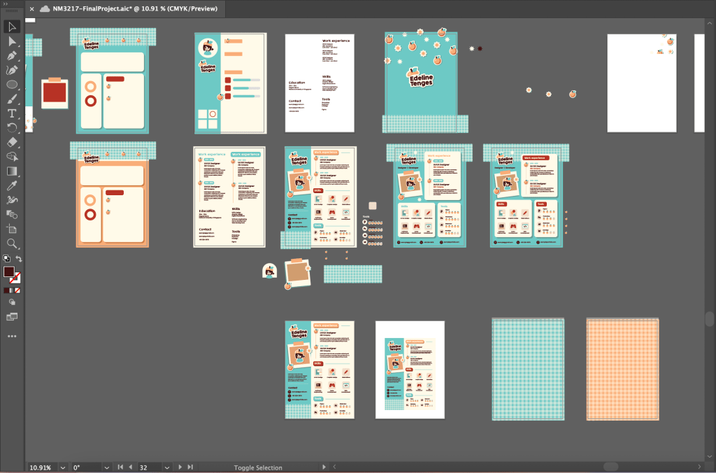
- Disbalance of white space on the page showing name cards
- Opportunity to add more elements of secondary graphics into the brand guideline as a whole
Improvements
- Typos have been fixed
- Inconsistency in logo variants have been fixed
- I can understand the concern about the identification of the tangerine, but I decided to keep the tangerine cap as it is in order to maintain the cute and cheerful energy. I felt that changing the leaf position would steer away from the intended impression.
- Leading has been tightened.
- White space on the name cards page has been balanced.
- More tangerine stickers and starburst graphics have been added to strengthen the brand guideline.
Workflow
- Adobe Illustrator
- To create most of the graphics
- Adobe InDesign
- To create and consolidate the brand guideline

-
Pattern (Exercise G)

Prompt:
- Using what you have learnt on elements of design, draw/create a pattern.
- You should also range it from the lightest to the darkest.
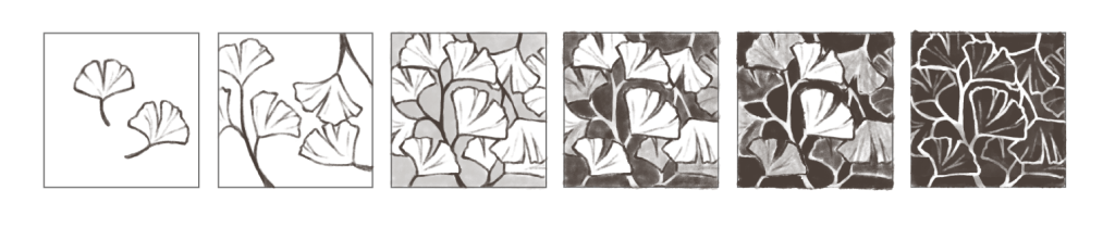
I decided to draw ginkgo leaves for the pattern, starting off with only two leaves, and slowly drawing more. In the later stages, I started adding some dark colour for the background and also added some shading for the leaves that are further behind for a sense of depth. In the last stage, the background is fully dark and the leaves are only left with their white outline.
-
Colour scheme (Exercise F)
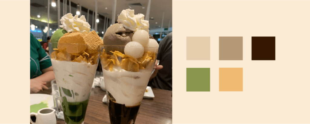
Prompt: Pick out five hues from the image and write a VERY SHORT write up on the hues, what mood are they conveying, if they are working well…

The earthy brown and green hues bring a cozy and relaxing mood, which is very fitting for this image of parfaits taken at a homey cafe. The muted, natural tones are also suitable for food-related imagery while giving a modern vibe, and the brighter orange-yellow colour adds just enough liveliness to the image and whets our appetites.
Even though this cafe is known for their green tea desserts, I like that the green only takes up a small portion of the colour scheme, because it further emphasises its effect as the accent colour. The range of light to dark brown shades do a great job in encapsulating the warm mood and complementing the accent matcha green colour.
-
Typography Case Study (Exercise E)

Prompt:
- What seems to be off about this particular typographic representation?
- How would you improve this typographic representation (look into the 8 rules for guiding points for discussion)

This typographic representation is going against 3 of the 8 rules we learnt.
Rule 4: Readability
The outline on both the title and body text is distracting and hinders readability. If the outline was an intentional stylistic choice, we could possibly keep it just for the title, depending on the purpose of the text. However, for the body text, removing the outline would help readers absorb the information more easily.
More ways to improve readability is to left align the text so that readers have an “anchor” to go back to.
Rule 5: Complementary typefaces
The current font being used is quite stylised, we could possibly change the body text to a simpler/plain font, perhaps sans serif to complement the casual style of the title.
Rule 6: Hierarchy
While there is an attempt to show hierarchy through different sizes for the title and body text, this could be made more apparent if the body text is in sentence case. It would also help with readability.
Since the body text is one long chunk, depending on the content of the text, it could possibly be split into different segments to highlight points of information.
Latest from the Blog
-
Brand Guideline (Final Project)
Thought process For the final project, I went with the first option (self-identity). My logo consists of my name in a clean but casual sans serif font, to give off a professional but friendly impression. The tangerine cap is a word play on “Tenges”, my surname. On a more personal level, my parents’ business was… Read more
-
Pattern (Exercise G)
Prompt: I decided to draw ginkgo leaves for the pattern, starting off with only two leaves, and slowly drawing more. In the later stages, I started adding some dark colour for the background and also added some shading for the leaves that are further behind for a sense of depth. In the last stage, the… Read more
-
Colour scheme (Exercise F)
Prompt: Pick out five hues from the image and write a VERY SHORT write up on the hues, what mood are they conveying, if they are working well… The earthy brown and green hues bring a cozy and relaxing mood, which is very fitting for this image of parfaits taken at a homey cafe. The… Read more
