Thought process
For the final project, I went with the first option (self-identity).
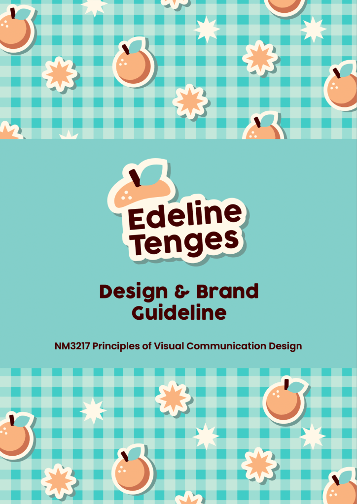

My logo consists of my name in a clean but casual sans serif font, to give off a professional but friendly impression. The tangerine cap is a word play on “Tenges”, my surname. On a more personal level, my parents’ business was originally named Orange, so I thought the tangerines theme would be nice.
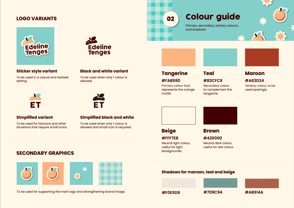
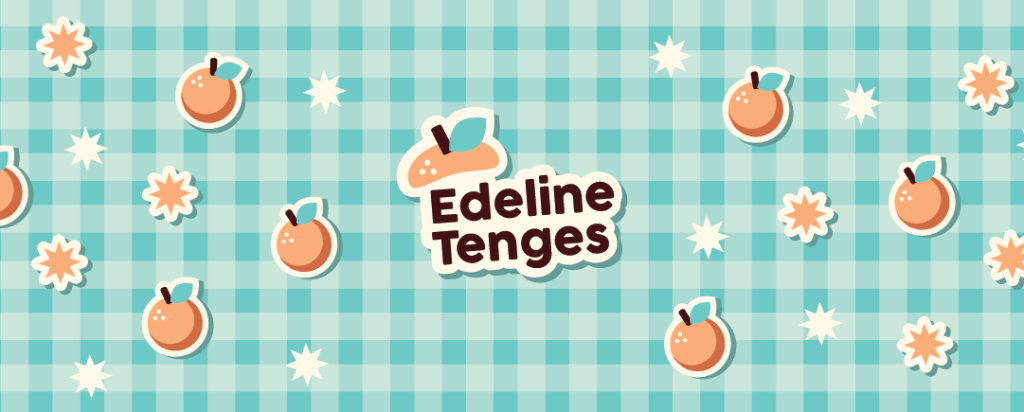
I created a stylised sticker version of the logo, along with other sticker-style secondary graphics. I run a small sticker shop on the side, so I thought stickers would be a great way to express myself. Stickers allow people to add personality to their everyday items, and in a deeper sense, people can keep their fond memories as a keepsake through stickers.
While coming up with the colour scheme, I started with a soft peachy-orange colour based on the tangerine theme. I added teal to complement the orange, and then I chose another warm colour maroon to add further depth to the colour scheme. I also like having a slightly beige and creamy colour to replace plain white, and a dark brown shade to replace pure black. Along the way, I also added colours for shadows because of the sticker graphics.

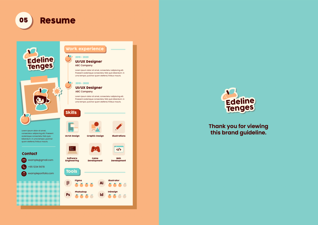
Feedback from forum
Here are the learning points and comments from the presentation:
- Typo errors in some parts of the brand guideline, which highlights the importance of proofreading my work.
- Inconsistencies in the logo variants — the presence and the lack of the three dots on the tangerine cap for the simplified logo.
- Lack of clarity on the shape of tangerine — it looks a bit like an apple because of the positioning of the leaf.
- Leading for some text on the colours page is too large, it is good to tighten leading to show information is related to each other
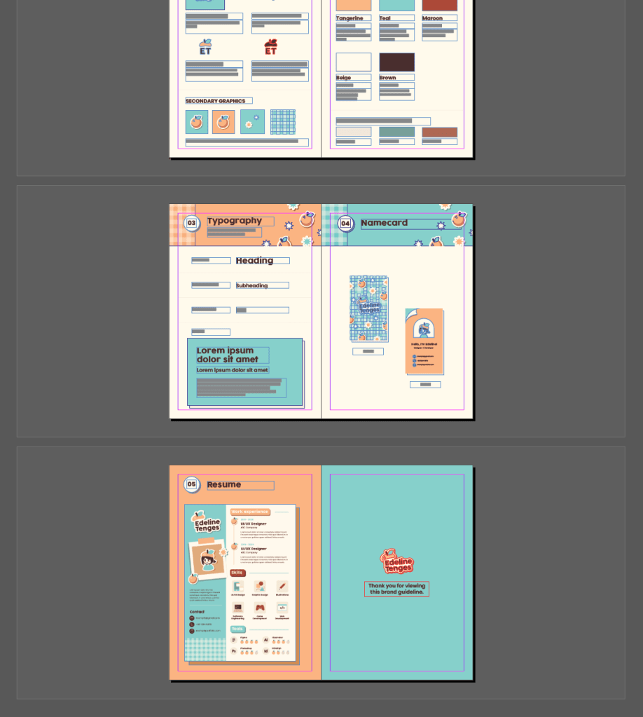
- Disbalance of white space on the page showing name cards
- Opportunity to add more elements of secondary graphics into the brand guideline as a whole
Improvements
- Typos have been fixed
- Inconsistency in logo variants have been fixed
- I can understand the concern about the identification of the tangerine, but I decided to keep the tangerine cap as it is in order to maintain the cute and cheerful energy. I felt that changing the leaf position would steer away from the intended impression.
- Leading has been tightened.
- White space on the name cards page has been balanced.
- More tangerine stickers and starburst graphics have been added to strengthen the brand guideline.
Workflow
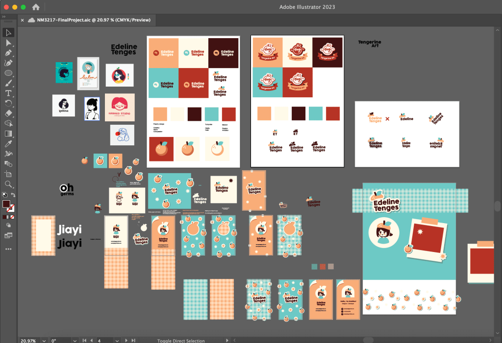
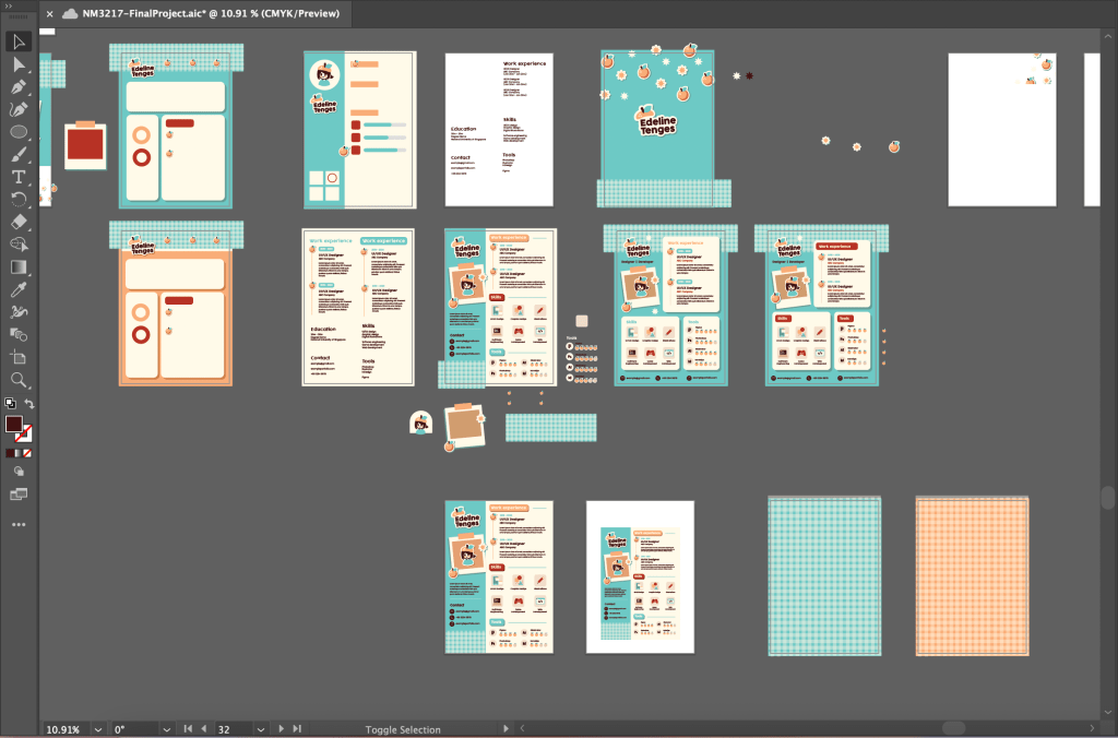
- Adobe Illustrator
- To create most of the graphics
- Adobe InDesign
- To create and consolidate the brand guideline

Leave a comment