
Introduction
My chosen topic for the infographic is food security and nutrition. I was focusing on how to make the information as easy to digest as possible, especially avoiding big chunks of text.

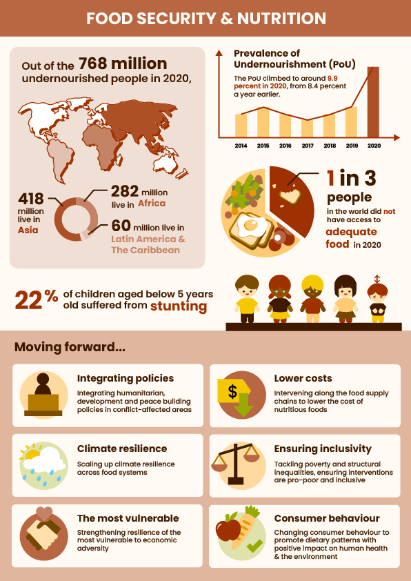
I used a world map to clearly represent location-related facts, and mapped the same colour intensities to the pie chart underneath it which represents the different proportions of where the undernourished people were from.
To visualise the sudden spike of Prevalence of Undernourishment (PoU) in 2020 after years of it being relatively constant in the years before, I used a bar graph and made the 2020 bar a different colour from the rest, to bring viewers’ eyes to it.
To show 1 out of 3 people not having access to adequate food, I used a pie chart again, but this time I represented it as a plate of food, with two-thirds of it filled with food, and one-third of it only bits and crumbs of food.
For the statistics of children who suffered from stunting, I visualised the percentage as 1 out of 5, with one child being shorter than the other four.
Lastly, for the section on actions to be done moving forward, I created an icon to represent each of the 6 points, to help viewers digest the information more quickly.
Critique: Learning points
One of the main concerns was that the title of the infographic was not prominent enough, so it was difficult to immediately understand what it is about. Some suggestions include making the title bigger, or putting the title in the red middle section where the children section is at.
Another concern is that the typography on the children section is focusing on the less important information — the exact number — instead of the percentage, which is what was being represented in the 1 out of 5 children visual. The illustration of the children also looked a bit misleading with the line on their heads, so there was a suggestion to add a floor to further emphasise that they are standing on the same ground and one is shorter than the rest.
Upon self-reflection after class, I felt that the overall infographic topic could have been made clearer, such as by having a central/main illustration that summarises the theme. However, this would require reworking almost the entire infographic, so I did not venture into that due to time constraints. Nevertheless, I will still keep this in mind as a learning point.
Improvements
I have enlarged and emphasised the title with a dark colour background block behind it, and I believe that it has helped with the clarity on the infographic’s theme.
I also adjusted the children section to emphasise the “22%” instead of the “149.2 million”, and added some ground below the children.
Workflow: Adobe workspace
Adobe Illustrator
- I used Illustrator to make all the icons and visuals.
- Tools used: Pen tool, Shape Builder tool, Shape tools

Leave a comment