Introduction
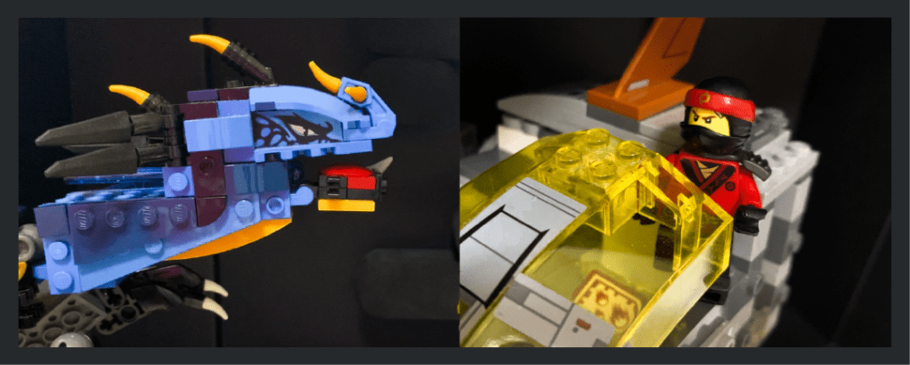
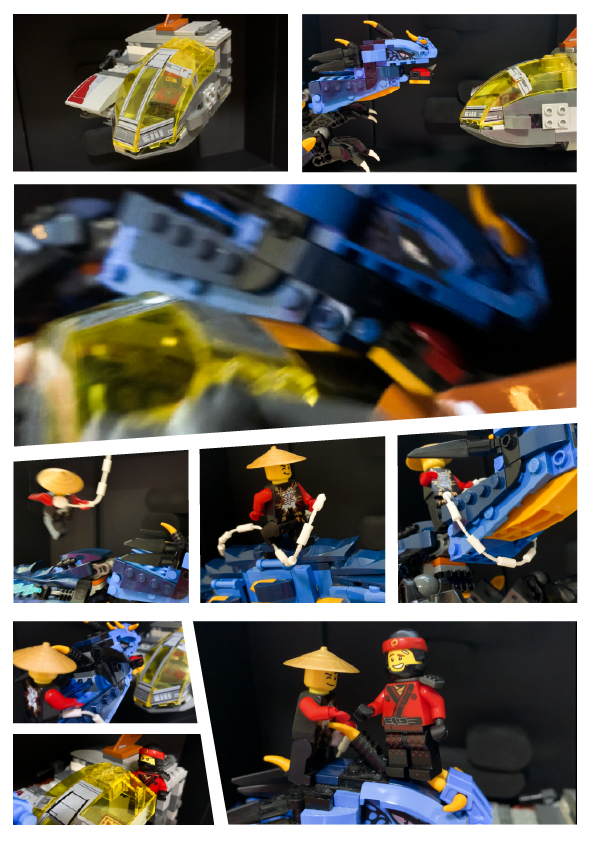
For this assignment, my concept is an action-movie with Lego characters, and I wanted to challenge myself to use good compositions and angles to communicate the action and adrenaline even with the constraints of static photos — and only 6-9 photos at that — while also telling a story without text.
Storyboard
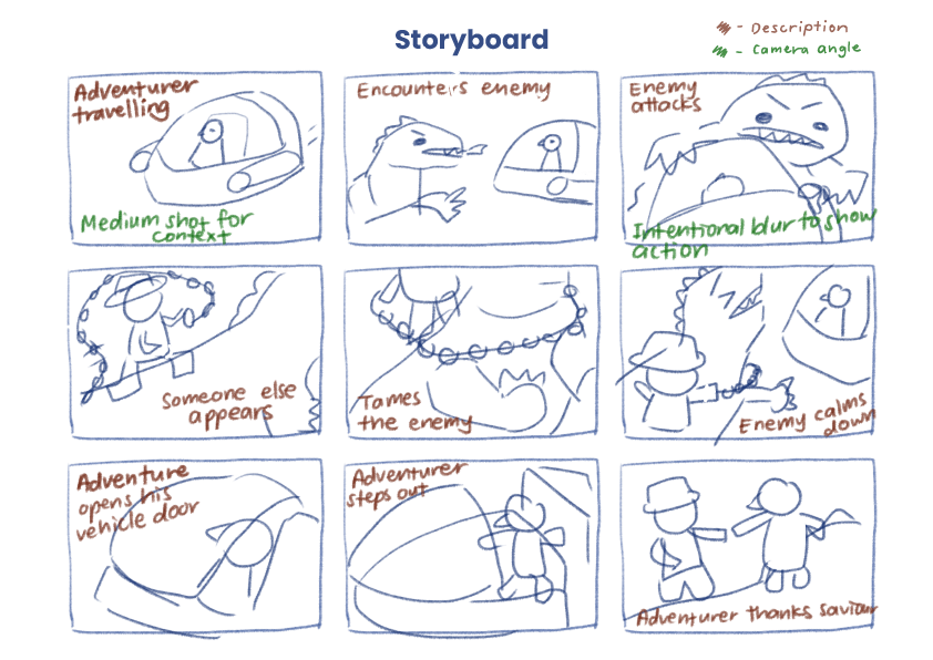
For the storyboard, I started by allocating the number of frames I want to spend on the beginning, middle and end of the story, to ensure that the pacing made sense. Next, I substantiated the contents of each frame, describing what the purpose of each frame is (as shown by the notes in brown). After that, I started to consider what type of shots would be most effective in communicating the intended message of each frame (as shown by the notes in green). For example, in the first frame, I wanted the shot to be far enough to give context of the environment and the vehicle, or in the third frame, I wanted to have motion blur to show the chaos when the dragon enemy attacks. With all that information, I proceeded to draw out the compositions of the frames I had in mind.
Layout
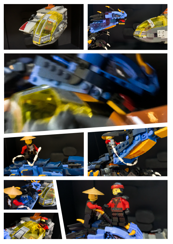
After the shots were taken, it was time to edit them and arrange them into the A4 format. I opted for a comic book style panel layout, mainly incorporating slanted edges to further emphasize the action element of the photos. I was mindful of the sizes of each shot — I wanted the larger photos to emphasize meaningful parts of the story, and wanted to group related shots together by keeping them in similar sizes and in the same row or column.
Critique & Improvements
The main comment from the critique is that there was insufficient context as to where the side character came from — was he always on the dragon’s back all along, or did he hop in halfway to save the adventurer from the dragon?
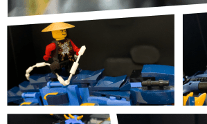
A suggestion from my peers and Prof Kai was to add one more shot of the character hopping or landing on the dragon.
I took the suggestion of adding one more shot of the side character jumping on the dragon, and I think it has helped to make the story flow more smoothly, as shown in the improved prototype below.
Workflow with Adobe
Adobe Photoshop
- I used Photoshop to sketch my storyboard

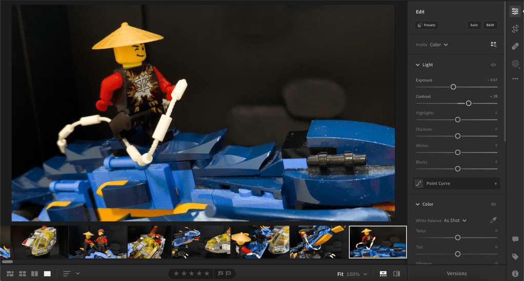
Adobe Lightroom
- I used Lightroom to adjust the colours of the photos, mainly to increase the contrast, which I thought was common in action-themed content.
Adobe Illustrator
- I used Illustrator to arrange the photos in the layout and to manipulate the edges and slant them for the comic book look.


Leave a comment