Japanese artist Avogado6 is known for their expressive symbolic illustrations that usually have a dark twist.
I chose to evaluate this artwork, titled “制作 クッキーのきもち”, which roughly translates to “feelings of a production cookie”.
Description: What is going on in the artwork?
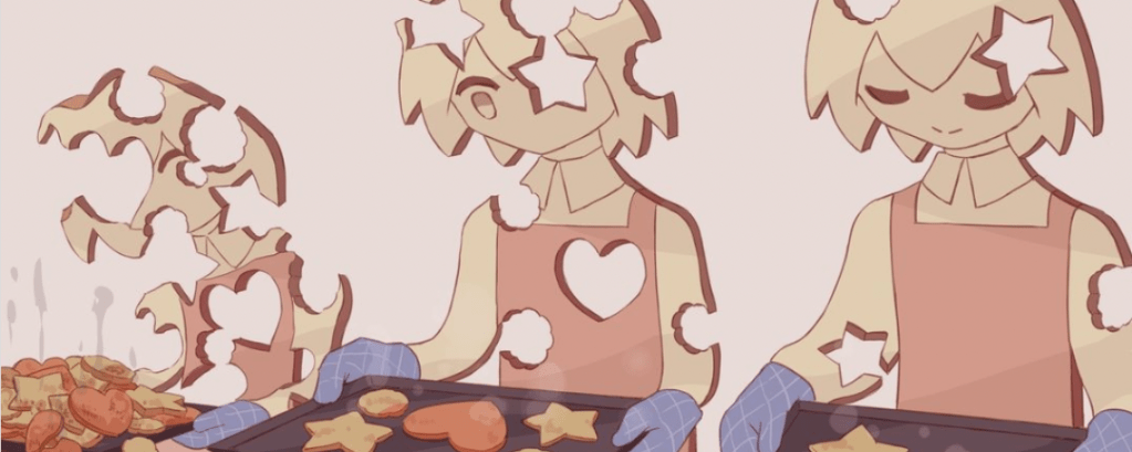
The artwork depicts 3 characters made out of cookies who are baking cookies. All 3 characters have cookie-cutter shaped holes on their bodies, and have cookies on their baking tray, ready to be contributed to the conveyor belt.
Analysis: How are things presented?
We can observe a gradual change in mood and cookie production amount across the 3 characters.
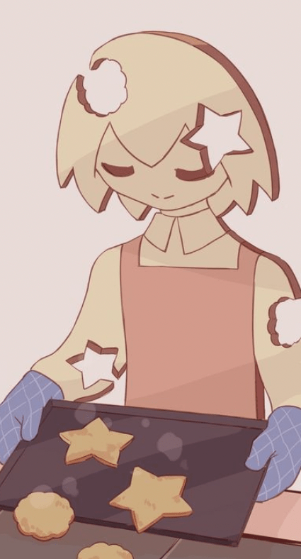
The character on the right has a calm expression, and has the least number of holes on their body. They also have the least number of cookies on their baking tray.
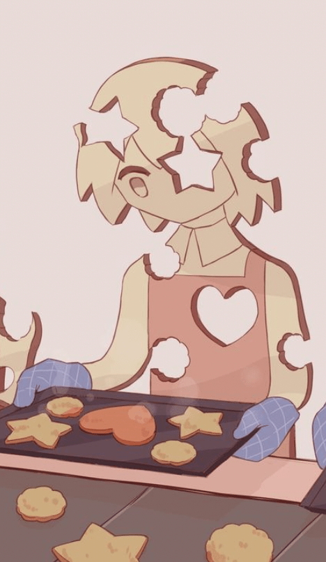
The character in the middle looks distraught, with more holes on their body, some taken from vital parts of the body such as the heart, brain, and one eye. They have more cookies on their baking tray than the calm character.

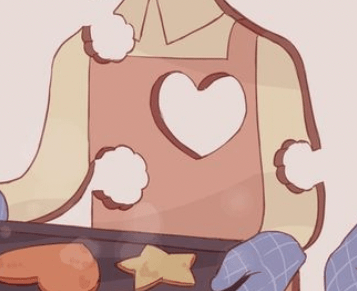
The character on the left looks overwhelmed and seems to be breaking down, with so many holes on their body that they can barely stand. We notice that both eyes/pupils are gone, and also their mouth. This character also has an overflowing pile of burnt cookies on their tray, including a broken heart cookie and inconsistently sized ones.
The way 3 characters are placed side by side in that specific order gives the impression that they are related. I wondered whether these 3 characters are actually the same person, just captured at different timings.
Interpretation: Meaning, implication or effect
From what I understand, the main meaning behind this artwork is being overworked and giving too much of yourself away.
The characters seem to be mass producing the cookies, as seen from how they are placing the baked cookies on a conveyor belt instead of a regular kitchen or bakery tabletop. Judging from how the shape and colours of the holes on the characters’ bodies match that of the cookies produced, we can deduce that they cut the cookies out of themselves. I interpreted this as pouring our energy into pushing deliverables, and a machine-like level of “mass producing” output for our work.
The gradual deterioration of the characters’ bodies could represent how our well-being is declining from overworking ourselves. We can sense that things start to cross the line when the characters start giving away important parts of their cookie body, like their eyes or heart.
The poor condition of the cookies made by the left character also implies that the quality of our work can decline as well. At that point, we have lost sight of what really matters, represented literally by the left character’s missing pupils.


Looking at the comments on the post, there are also people who interpreted this as forgetting our own needs to give to others, which I think makes sense as well.
Judgement: Evaluation of success and shortcomings
The artwork successfully brings the sense of warmth and love associated with handmade cookies while also contrasting it with the cold and rigid machine-like standardisation of mass production associated with the conveyor belt. This is further emphasised by the symbolism of cookie cutters — relating to overly stereotypic and formulaic methods that do not account for a person’s individuality.
For shortcomings, something that caught my attention was the way Avogado6 chose to use pastel colours for this artwork. I expected a dark theme to be further strengthened through a darker moody palette. At first I thought the colours chosen might just be because of the art style as it is not uncommon to see Avogado6 use unsettling cheerful colours and smiles all over a piece that has a dark meaning. However, I noticed Avogado6 does use darker colours from time to time, which made me wonder whether the pastel colours were intentional. Perhaps this contrast between the light colours and the dark symbolism is exactly what captures people’s attention.
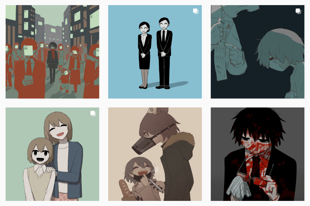
Another “shortcoming” is the ambiguity in whether the production is moving left to right or right to left. I was wondering why Avogado6 positioned the healthier character on the right and the deteriorated character on the left, instead of the other way around to follow the natural flow of reading. However, I had the realisation that in Japanese media, people tend to read from right to left, so the current order would actually make sense. The reason why I pointed out the order is because reading in the reverse order could result in a different interpretation where the character gradually improves, learns about their boundaries and protects themselves. Nevertheless, considering the irreversibility of baking cookies — burnt cookies can no longer be reversed and unburnt — my intuition tells me that the intended message is the deterioration instead of the healing.
Overall, I think the objects used in the artwork are very carefully chosen and hence effective in evoking the intended emotions, and it is quite frankly, genius to me.

Leave a comment